Until a about a year ago, Dover Saddlery’s seasonal inventory arrived on the doorstep with the charm (and toe-crushing thud) of a Sears catalog. Its pages didn’t necessarily evoke a sense of desire, but rather reminded us of the barn staples we simply needed: bell boots, salt blocks, hoof picks. Suffice it to say, we weren’t exactly drawing a long, hot bath and settling into our suds for an evening escape with Dover. For that, we relied upon T: The New York Times style magazine.
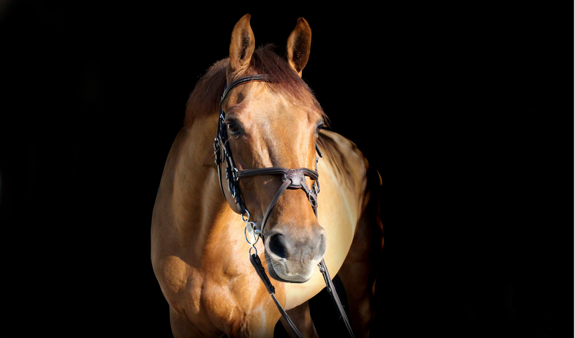
So we couldn’t help but notice when Dover debuted an elegant, Playbook-size folio filled with black and white photography highlighting an assortment of exclusive brand partnerships just in time for the holidays of 2016. The platinum-hued imagery was well thought out, and it captured—among other surprising delights—a dapple grey suspended in motion, tight shots of polished tack decorating the walls of a whitewashed barn, Italian riding boots standing proudly on horseshoe-stamped concrete, and yet another handsome grey framed by the photo-studio finish of a speedlight flash. Words such as timeless, sterling, classic, tailored, and chic topped the pages in a Didot font familiar to readers of Vogue. A complete transformation! And yet there was no note acknowledging the aesthetic shift, no nod toward the very talented lens [wo]man, and no reassurance that this was not a temporary phase. It just…happened.
We were intrigued.
Riders are constantly replacing gear, reordering supplies, or refilling something. It’s inevitable, so if you are in the business of taking our money, we don’t mind if you seduce us first with a little Annie Leibowitz-style eye candy to help encourage our purchase. At OR, we’ve long thought this was a missed opportunity. The equestrian world deserves the same level of art direction one might find when, say, shopping for a slow-cooker at Williams Sonoma—the luxurious presentation of a lifestyle that can be bought into (despite the fact that it’s one upon which we’re already sold). Naturally, we understand that hay nets might not command the same creative budget as Samshield’s Swarovski crystal helmet, but there are many sophisticated products on the market that do deserve a visual environment as beautiful as the items themselves.
It is for this reason that we applaud Dover’s new approach, and give a deserving shout out to Sandra Ranke, fashion industry veteran and the company’s latest freelance Creative Director. We will admit to enjoying a few hot soaks in the tub with each catalog this year (thanks in no small part to Ranke), and are delighted to share the five things we love most about the company’s print makeover:
1. Believable Imagery

We pretty much assumed 99.9% of the models had never been on a horse (with the exception of the usual cover pro). Now there are mounted riders that look like our very own hack buddies.
2. A Tug of the Heartstrings

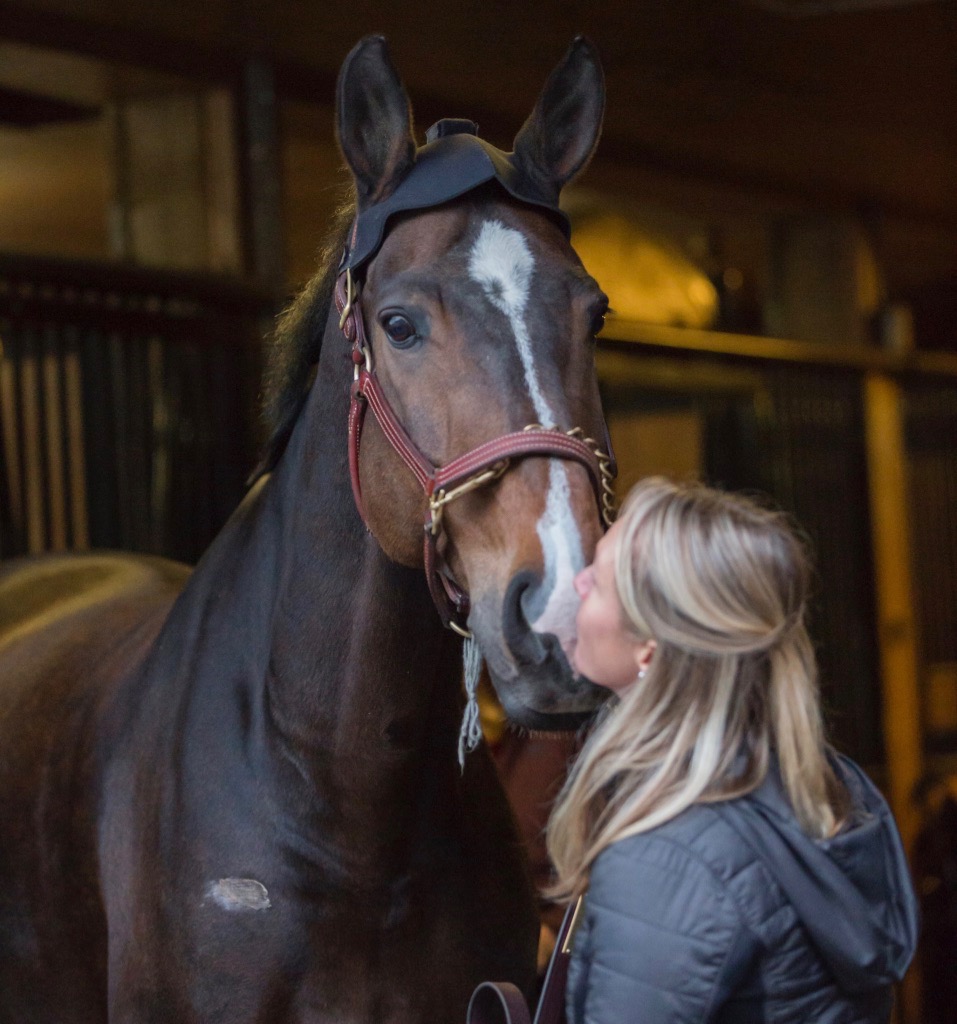
A pigtailed young girl receiving nuzzles from her beloved horse on a chilly fall morning. Need we say more?
3. Heavy Paper Stock

Everyone knows that luxury is in the details, and choice paper stock is no exception. We couldn’t pry our hands from the texture of the Spring 2017 catalog.
4. A More Fashionable Display

An elevated quality of merchandising, where garments and tack are arranged in attractive layouts, color combinations, and with suggested head-to-toe looks.
5. A New Logo

We are fans of the charcoal “D” that is embellished with a gold “S.” We’d love to see more of it!
We made an oath never to feature obvious essentials like hoof picks on OR (#nohoofpickshere). However, we do actually use hoof picks, so we know someone has to do it. Our helmets are off to Dover Saddlery for doing it in a refined way, because when the stalls have been cleaned, the horses have been fed, and the night has been checked, cracking a catalog that makes it all look a bit more glamorous certainly makes it all feel a little less like work.
Original Image Source: Dover Saddlery